
When working on a dashboard in Tableau, as the creator, we want to make it so anyone can be able to navigate the dashboard as easily as possible. Basically, we want to create it so the user will have no question in their mind to how each piece of the dashboard functions. The less questions, the better! In this post, I would like to go over one simple thing that can make looking at a weekly dashboard a lot easier for the user. I will be going over how to create a filter to include a date range with a week number.
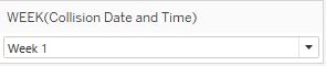
Tableau handles dates very well, but when trying to filter your dashboard by week, it leaves a lot to be desired from the standpoint of the user. Although, Tableau is able to identify what week number a particular date is in, when it is being used in a filter, all you will see is Week 1, Week 2, Week 3, etc. As the user looking at the dashboard, it would be useful for me to know what date ranges these week numbers pertain to. I would want to know that Week 2 in 2018 is January 7 through January 13.
The filter becomes even harder to understand when you have multiple years of data. What Tableau will do is create the same filter using the week numbers, but the data for each year will be grouped together by week number. For example, if you have data from 2016 through 2018, when you filter for Week 1, you will see the data for Week 1 of 2016, 2017 and 2018. If you wanted to see how Week 1 would compare to Week two over multiple years, I guess this would work, but I think it would be much more useful to be able to see the weeks by itself instead of grouped together.
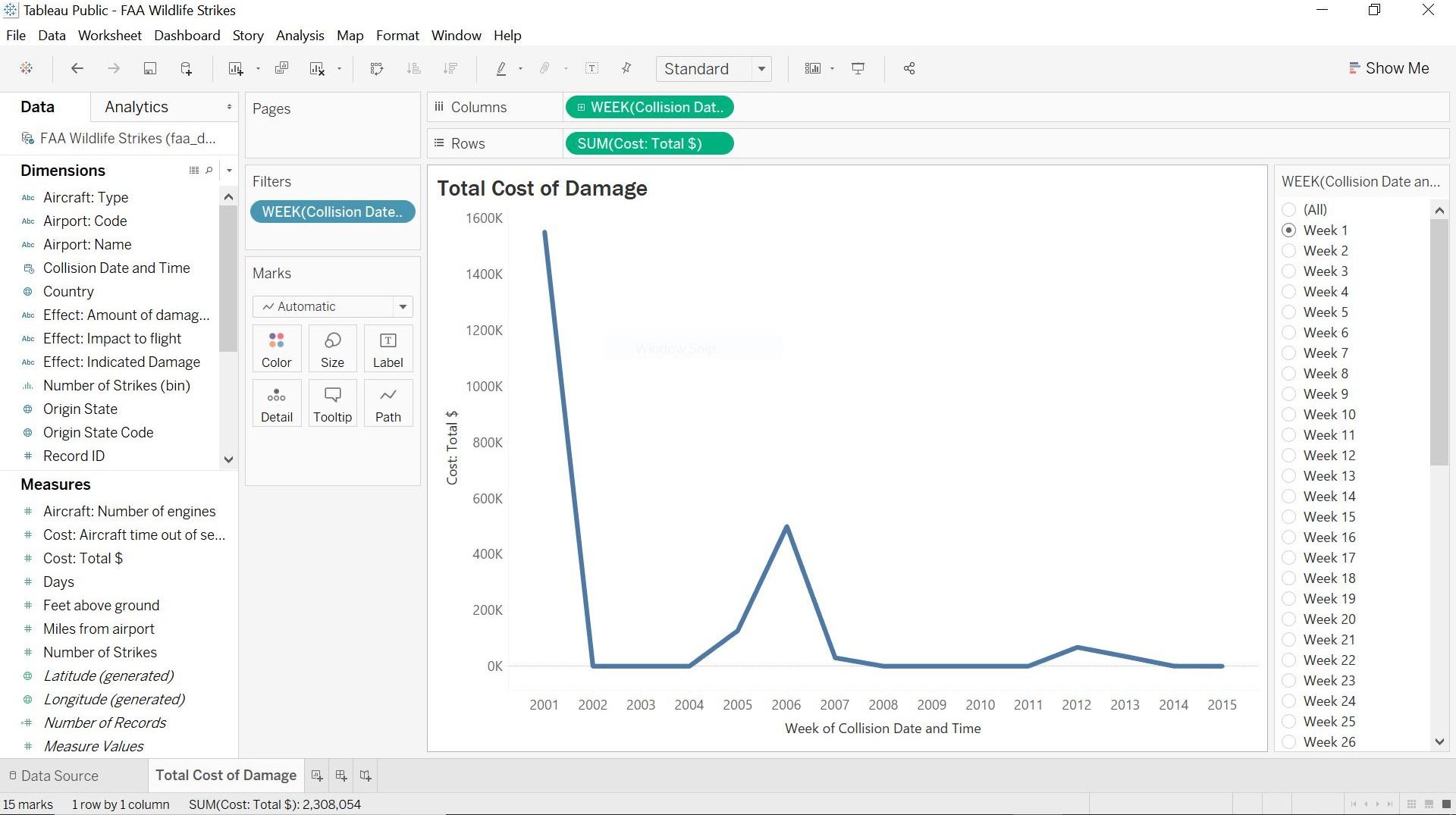
Visualization using week as a filter. As you can see, instead of being able to see an individual week, the viz will show the week selected for every single year in your data set.
This issue can easily be fixed by using a calculated field and dragging the calculation into the filter section. When creating this weekly filter, I like to use the following format:
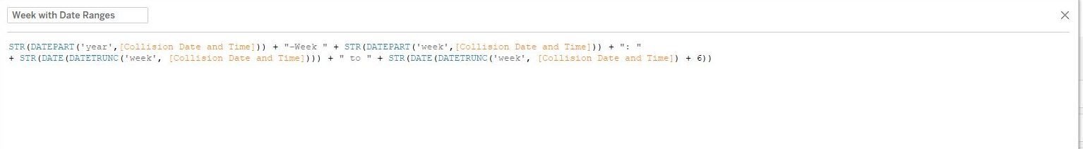
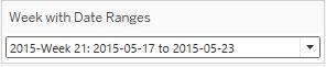
YYYY-Week X: YYYY-MM-DD to YYYY-MM-DD, where YYYY is the 4-digit year, MM is the month, DD is the day, and X is the week number.
I particularly like using this format because when you show the filter in Tableau, it will sort first numerically, then alphabetically. In this instance, I will then have the dates arranged by earliest to latest.
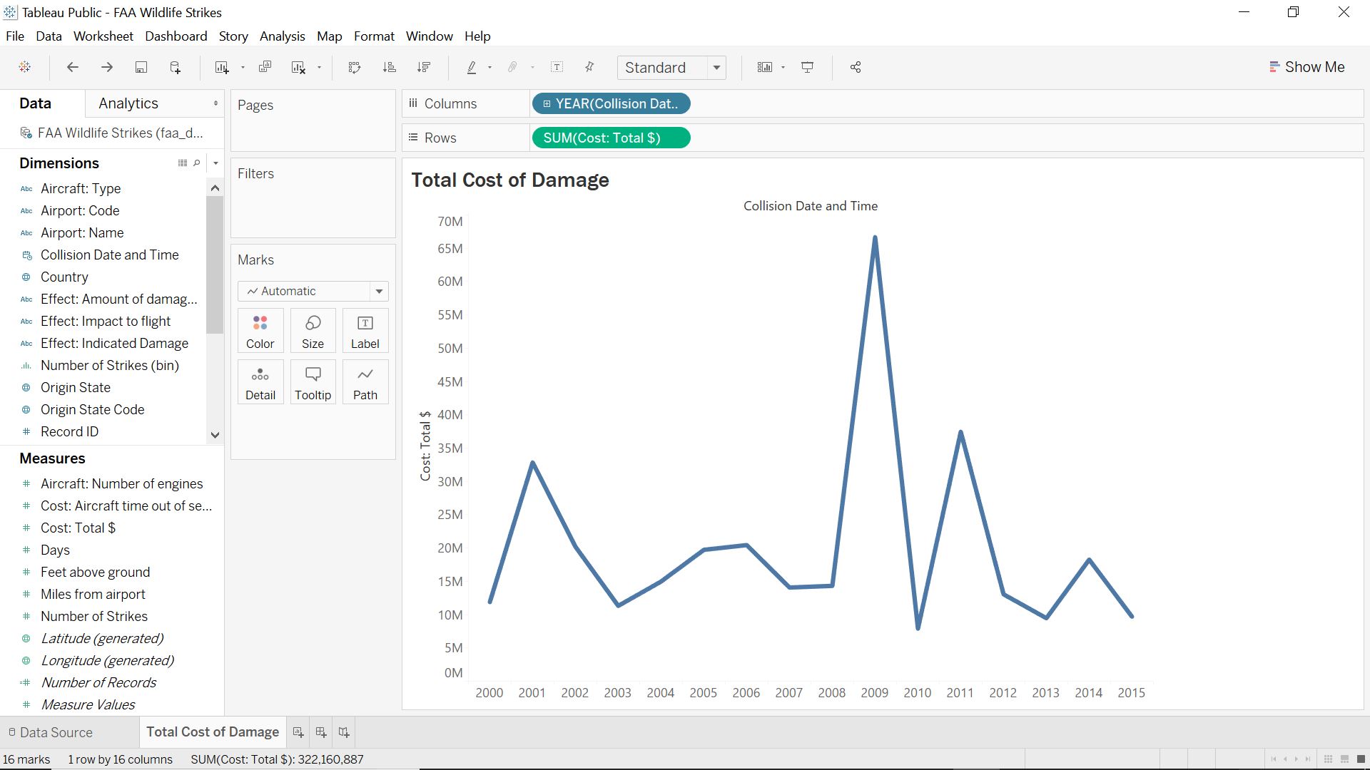
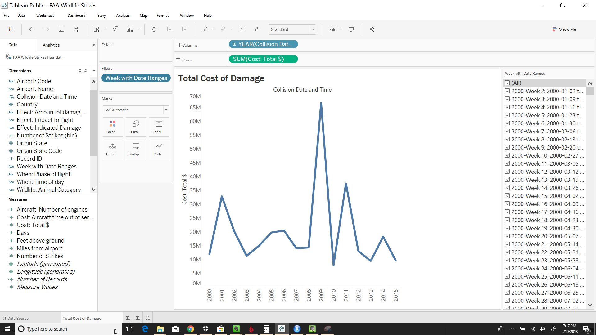
Here is a step-by-step guide in how to create this weekly filter. In this guide, I will be using the FAA Wildlife Strike data set found in Tableau Public (I will do future blog posts actually analyzing this data set). For the purpose on showing you how to create a weekly filter with the date range, I will show the total cost of damages to airplanes because of wildlife over a 15 year span (2000-2015). This guide will assume you already know how to connect to your data and create a new sheet.
- Drag Collision Date and Time from Dimensions and into Columns. Then drag Cost: Total $ from Measures to Rows. This should automatically create a line graph; if it doesn’t, select a line graph from the Show Me tab.
- Create a calculated field by going to Analysis > Create Calculated Field.
- Name the calculation Week with Date Ranges, or whatever else you prefer. Use the formula shown below to create a field with the date format mentioned earlier. Here is an article from Interworks, that gives a good explanation about the different date functions in Tableau, but I will also go over the different elements in our example below.
- Note: Each date function needs to be wrapped in the STR function to turn the integer created from the date functions to a string. Tableau does not allow you to concatenate integers with strings, hence why we make the date functions into strings.
- DATEPART(‘year’, [Collision Date and Time]) gives the year from the given date in the Collision Date and Time dimension.
- DATEPART(‘week’, [Collision Date and Time]) gives the week number from the give date in the Collision Date and Time dimension.
- DATETRUNC(‘week’, [Collision Date and Time]) truncates the given date to the accuracy of the datepart given (week). In this case, this formula will give you the date at the start of the week of a given date (i.e. 6/6/2018 results in 2018-06-03, because it is the start of the week June 6th is in).
- Note: The DATETRUNC function is also wrapped in a DATE function here to remove the time from the date.
- The last element of the calculation adds 6 to the previous formula; this will give you the date for the end of the week.
- Drag the Week with Date Ranges to Filters. Click on All, then click OK to Continue.
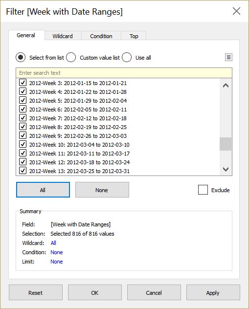
- Right-click on Week with Date Ranges in Filters, then select Show Filter.
- Click on the down arrow located on the top right corner of the filter (need to hover over the top right corner to see arrow). Then select Single value (dropdown). This will allow the user to only select one week at a time.
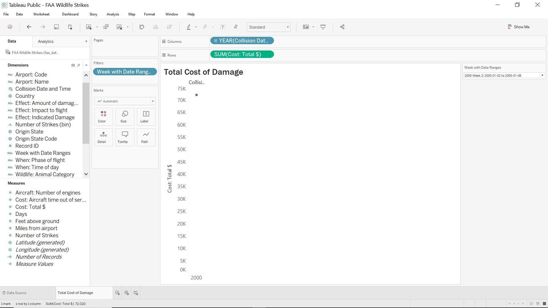
- Lastly, right click on YEAR(Collision Date and Time) in the columns section, then select Exact Date. This will give the graph we want showing a weekly view.
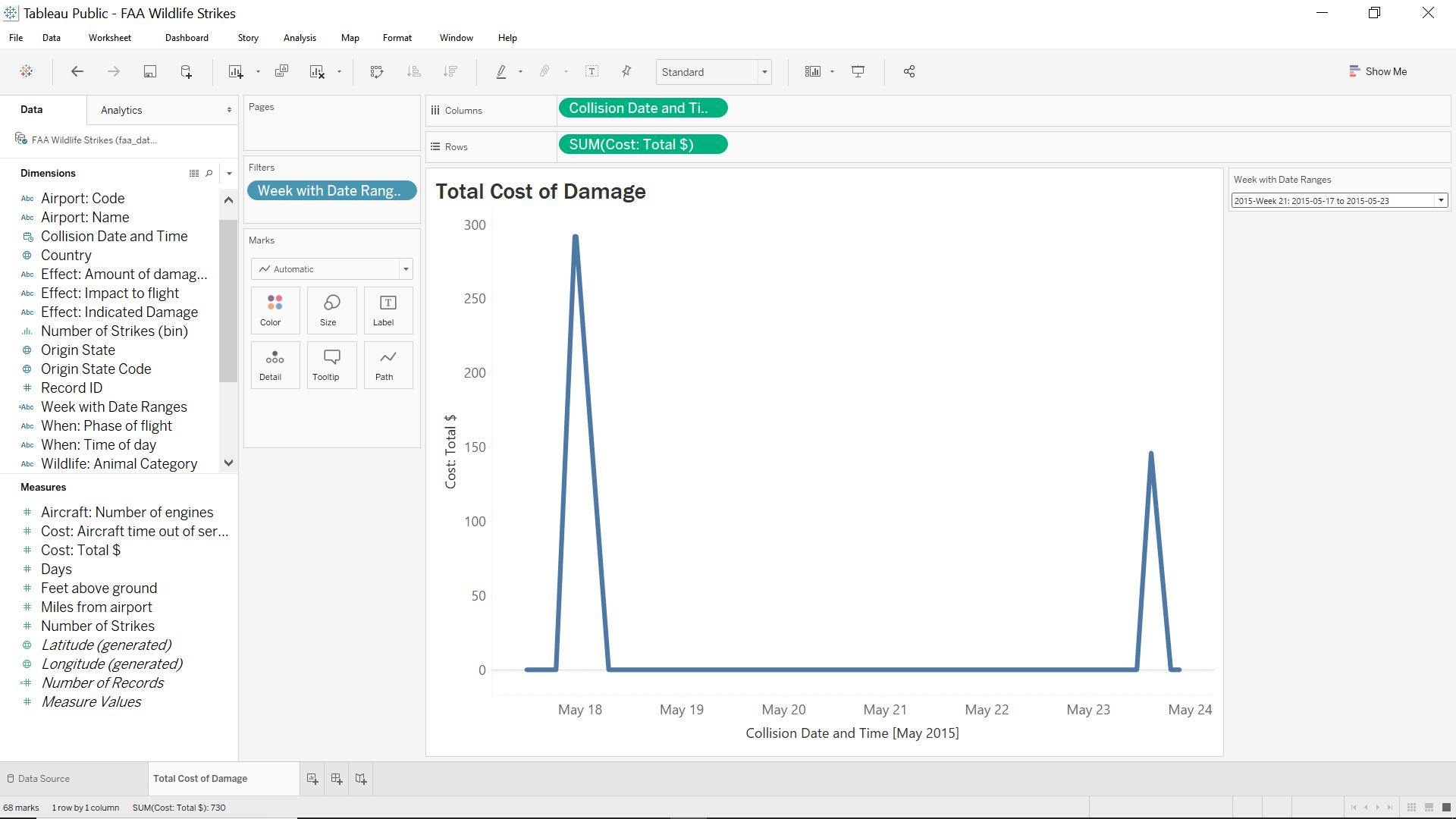
That is all it takes to create a user friendly, weekly dashboard/chart. With the calculation, the user can now at least identify the year, week, and the actual date range the week number pertains to. If you have a simpler or better way of doing something like this, feel free to leave me a comment. This is the way I figured out how to do it, but I am always looking for ways to become better and more efficient.
BEFORE
AFTER