Sankey Diagrams are one of those charts that people never knew they wanted or needed until they’ve actually seen it. That is very unfortunate because when used correctly, a Sankey Diagram can provide an eye-catching visualization that provides great insights into your data. I feel Sankey Diagrams are under-utilized, mostly in part because people are unaware of what exactly it is and it’s use case, but also most of the leading visualization and BI software today do not have Sankey Diagrams as a built-in option, including the leader in the market, Tableau.
Purpose of this Sankey Article
In my profession as a data analyst, I use Tableau every day and have made a handful of my own Sankey Diagrams for the data I analyze. I knew what a Sankey Diagram was and it’s possibilities for visualizing data, but I had no idea where to even start to create this in Tableau. With help from the Tableau community, though, there have been a handful of people who, over the years, have come up with innovative ways to create this type of diagram.
Hence, in this post, I will not list a step-by-step process on how to achieve the visualization, because there are a couple of resources I’ve used to help me achieve this, but I will give a short explanation of what a Sankey diagram is, and a couple of things I came across that may be helpful to you when following the instructions of the sources I will list below.
What is a Sankey Diagram?
Before I get into the creation of a Sankey diagram, let me first explain what it is and how it can be used in your own analysis. According to a Wikipedia article, a Sankey diagram is a specific type of flow diagram in which the width of the arrows representing the flow is proportionate to the quantity of the flow.
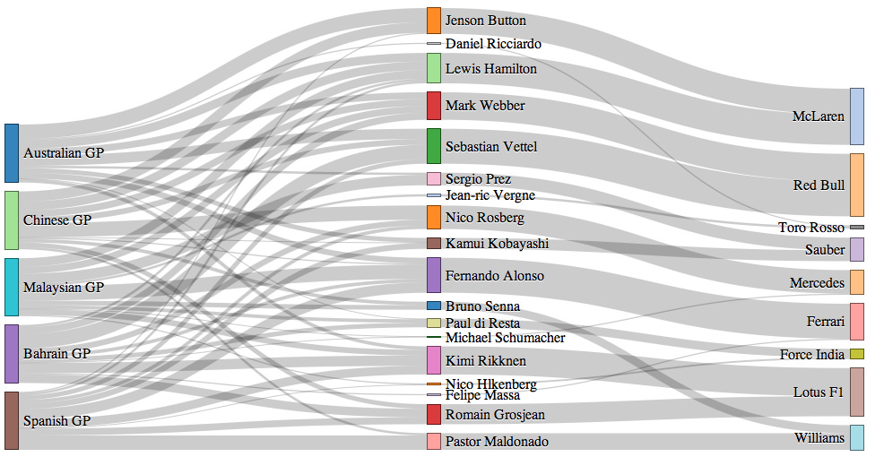
Example of a Sankey Diagram showing the points between country, driver and car make.
As you can see in the example above, it shows the flow of points between three different categories associated with the F1 Driver’s Championship: country, driver, and car make. You can see the width of the flow is the number of points associated with the category it is flowing out of and the category it is flowing into.
Sankey diagrams are perfect for visualizing the flow of quantities between different categories of items. Other than the case example above, it can be used to show the flow of cash, the flow of energy, or in my case is the healthcare industry, it can show the flow of the number of patients going between departments or even used in a project management tool to show the number of hours worked between the type of work being performed and the analyst performing the work. I am sure you would be able to find a way to use a Sankey diagram for your particular use case.
How to Create Sankey Diagrams in Tableau
As I mentioned before, I use Tableau in my work every day, as does a lot of other data analysts and scientists. There is no easy way to create a Sankey diagram in Tableau, but I have to give thanks to this article from Ian Baldwin at the Information Lab and this video from SuperDataScience, which guided me into creating my own Sankey diagrams. The article on the Information Lab website has a great step-by-step guide to creating the diagram, which uses over 20 calculations! I found in my case, I had to use a mix between what was in the article and what was mentioned in the SuperDataScience video to achieve the Sankey diagram I wanted.
These sources provide great information, which I will not repeat here, but here are a couple things I took note of while in the process of creating my own diagrams. Here is a list of items I used from the SuperDataScience video that is not listed in the guide from The Information Lab:
- Using 49 instead of 97 for the Path Frame calculation (ToPad in the video).
- I found when creating my diagram, using 97 actually duplicated the arrows going between my two categories. Changing 97 into 49 removed the duplicates from the diagram.
- The video makes a good suggestion of fixing the axis of your diagram. For the x-axis, fix the axis to go from -5 to 5 and the y-axis to go from 0 to 1. This will make it so the flow arrows take up more space horizontally and vertically to reduce the whitespace.
- Reverse the y-axis because your flow is originally in descending alphabetical order. This will mess up where your flow starts and ends if you don’t reverse the axis.
- The Information Lab article uses polygons as it’s mark type, this doesn’t allow you to change the size of the flow arrows. Switching it to a line instead allows you to change the size of the flow arrows.
- To achieve this functionality, you need to create one more calculation, which is: WINDOW_AVG(SUM([your measure])).
- Drag this new measure to the Size mark.
- Right-click the pill and select Compute Using -> Path Frame (bin) (Path Frame (bin) is the name of one of the calculations from The Information Lab article)
These are some things I came across when creating my diagram, and I will update this list if I come across any more differentiation between the two sources and what I’m trying to accomplish.
Go Ahead and Wow your Boss
I hope this post is helpful in pushing you to be creative and using a fun and unique way to visualize your data. Because this is a diagram people don’t see very often, you will definitely amaze the people you show this off to. Don’t let the number of steps scare you off, either, because the finished product is definitely worth it.
Resources
Here is a list of resources I’ve used in my quest for creating the perfect Sankey diagram: